

Zeta Psi Magazine
The Zeta Psi Magazine was created for the Zeta Psi Chapter of the Delta Zeta Sorority. As Historian Chair, I wanted to create a magazine as a way to record all of events and achievements. This was the first time chapter had its own magazine or anything similar. In the past, around the 1980s to early 2000s, the chapter create scrapbooks by hand and it was time to upgrade.
Pages: 24
Sold: 50+ copies
Printed and Delivered by Blurb
Design Process
Sketched out all of the page layouts and their order.
Moved it over to Adobe InDesign and labeled each page.
Filled the boxes with images throughout the semester.
Rearranged the layout based on text and images.
Held photoshoots and edited images.
Edited the articles from the Chapter officers.
Printed and revised magazine multiple times.
Design Sketches
-
![]()
Cover and Table of Contents page layout
-
![]()
Community service page layout
-
![]()
Senior page layout
-
![]()
Alumni page layout
-
![]()
List of pages and their order


Concept and Inspiration
Main Concept
A sorority magazine centered around sisterhood, empowerment, and celebration of achievements. The goal was to create a magazine the fosters a sense of community and showcases the accomplishments of sorority members.
Inspiration Source
While being on TikTok, I found a video of a sorority member who made a magazine for the seniors. I thought that I could do the same, but for the entire sorority chapter including chapter members, parents, and alumni.
Visual References
I wanted it to be like a yearbook, full of pictures of the events throughout the semester. Design wise, I wanted it to have more of a magazine feel than a yearbook. The magazine needed to have a fun girly aesthetic with powerful colors.
Challenges and Solution
Organizing a diverse range of content, including articles, event highlights, and member profiles, in a coherent and visually appealing manner.
To overcome this, I created a clear hierarchy by using consistent typography, color coding, and section dividers. Additionally, implementing a grid-based layout system can help maintain consistency while providing flexibility for various content types.

Sketch layout
Adobe InDesign layout

Final Printed layout
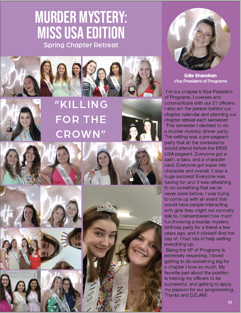
The issue with this layout was there were not many high-quality images to use. Most of the images seemed to have a repeated style. The final decision was to remove images with members who had already been pictured in the magazine and include images that had a unique composite and members who had not been pictured yet.
Deliverables


Results and Impact
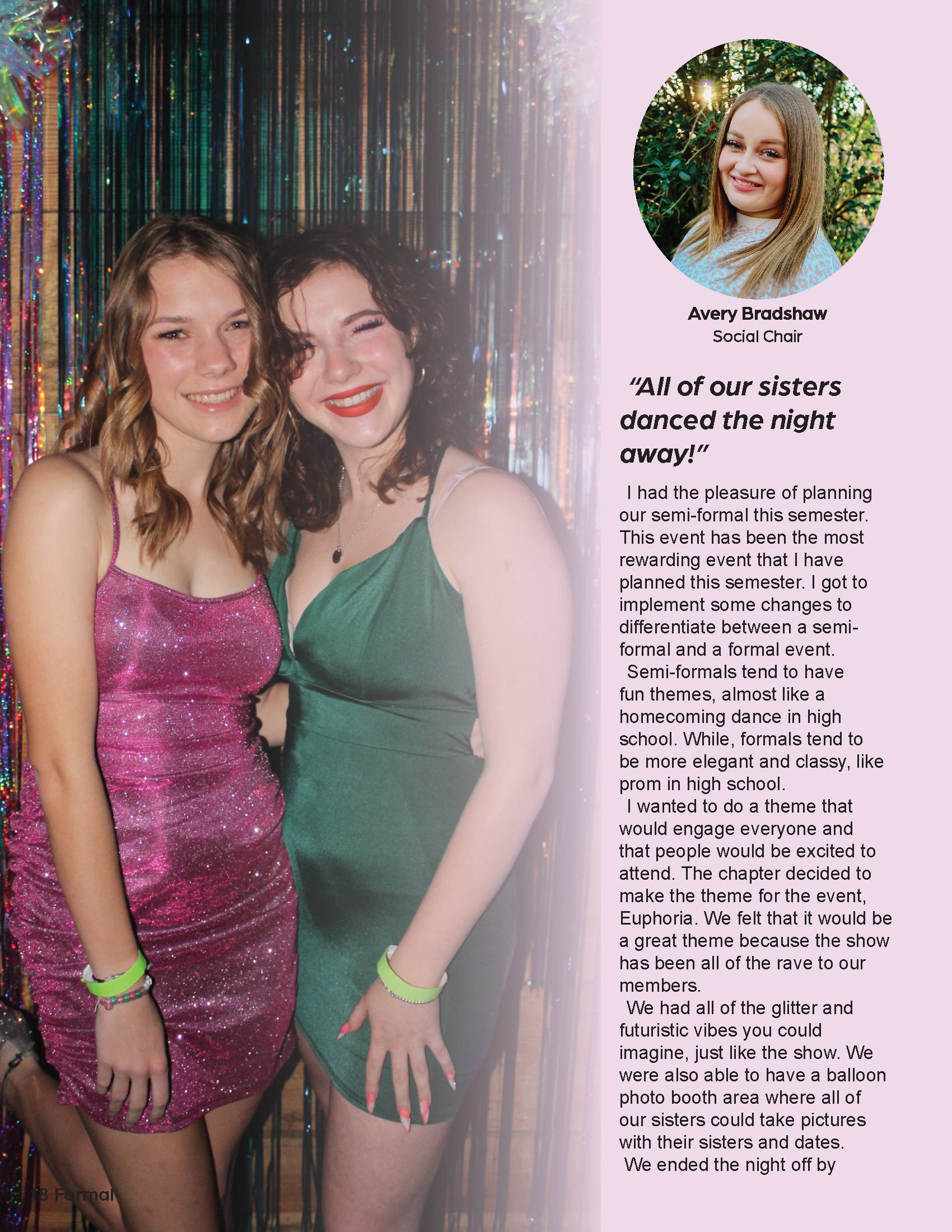
Abbey
“My parents loved it! My dad said it was great!”
Katerine
“Dude, it looks good! I hope it continues.”
Stacie
“Fun! I ordered one for Avery. Can’t wait to see it.”
Megan
“Super Cute!!!”
The magazine received enthusiastic praise from chapter members, parents, and alumni alike. Chapter members delighted in the opportunity to reminisce about cherished memories and celebrate their achievements. Parents and alumni expressed heartfelt appreciation for the magazine's ability to showcase the chapter's growth and capture the essence of its vibrant events.
The positive feedback from all served as a testament to the magazine's impactful design, fostering a strong sense of connection, pride, and nostalgia within the sorority community.
Reflection and Lessons
After reflection and seeing the final printed product there are some design changes that I would make. I feel that I have grown as a designer since making that Zeta Psi magazine. There was a book that helped me see that I could have included color a different way then just the background color. The book was White Space Is Not Your Enemy: A Beginner's Guide to Communicating Visually Through Graphic, Web and Multimedia Design Book by Kim Golombisky and Rebecca Hagen.
Removed the background colors.
Change some page layouts to let the pages breathe more.
Edited images more to have a consistent color scheme.
Added illustrations to give color and depth.